Data Visualization Dashboards: Turning Data into Actionable Strategy

In today’s fast-paced business environment, teams aren’t struggling with a lack of data; they're drowning in it. Project timelines, resource availability, task dependencies, performance metrics, budgets, communication logs every tool captures information, yet very few convert it into clarity. And when visibility is fragmented, decision-making slows, collaboration weakens, and execution suffers.This is where data visualization dashboards have become indispensable. They bridge the gap between raw data and business impact, transforming scattered information into real-time insight. For project managers, team leads, and business executives, dashboards are no longer a “nice-to-have"; they're the backbone of efficient, data-driven work.
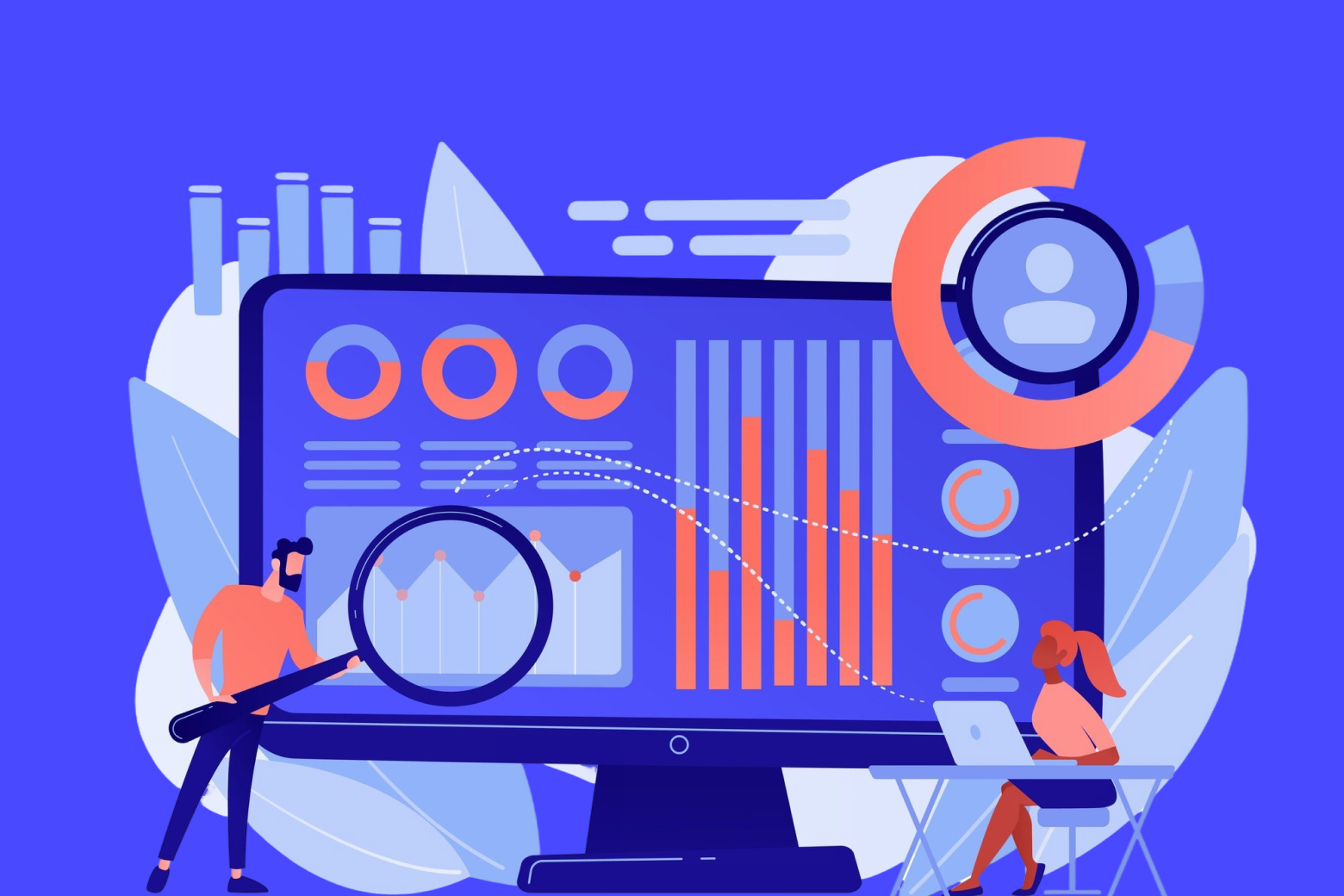
Why Data Visualization Dashboards Matter
A well-crafted dashboard consolidates everything that matters into one clear, visual, and interactive space. For modern teams navigating multiple projects, shifting priorities, and quick decision cycles, dashboards deliver four key advantages:
1. A Single Source of Truth
Instead of piecing together updates from emails, chats, spreadsheets, and tools, dashboards unify all project data in one view. Whether you’re tracking sprint velocity, monitoring budget burn-down, or reviewing task completion rates, you see exactly what’s happening without hunting.
2. Real-Time Performance Insights
Dashboards update instantly. This means:
- Project managers know when tasks slip.
- Team leads see where workloads spike.
- Executives monitor project ROI as it evolves.
Real-time visibility allows teams to pivot quickly and make decisions proactively, not reactively.
3. Trend Identification & Predictive Clarity
Dashboards aren’t just about the present, they help you understand the past and forecast the future. Trend lines, heatmaps, and comparative charts reveal:
- Patterns in resource bottlenecks
- Historical velocity shifts
- Budget deviations
- Delivery risks
This enables smarter planning and risk prevention.
4. Enhanced Accountability
When progress is visible, ownership follows naturally. Dashboards make performance transparent without micromanagement, empowering individuals and teams to self-correct and stay aligned.
The Anatomy of an Effective Dashboard
Not all dashboards are created equal. The best ones are purposeful, intuitive, and tailored to the user’s goals. Here’s what sets a high-impact dashboard apart:
1. Clarity Above All
Every chart, metric, and widget should answer a question. Effective dashboards avoid clutter and prioritize essential KPIs such as:
- Deadlines at risk
- Tasks completed vs. pending
- Budget allocation
- Team workload distribution
2. Viewer-Centric Design
Executives don’t need the same details as developers. Great dashboards adapt to:
- Role
- Responsibility
- Decision-making needs
This relevance boosts adoption and impact.
3. Interactivity & Drill-Down
A good dashboard lets you click, filter, and explore. Interactivity turns a static snapshot into a dynamic, investigative tool.
4. Real-Time Data Integration
Stale data leads to stale decisions. Automated syncing ensures insights always reflect the current state of work.
5. KPI-Focused Structure
Dashboards should revolve around goals, project KPIs, sprint objectives, financial targets, or operational metrics. What gets visualized gets improved.
Types of Dashboards
Different contexts call for different dashboards:
- Strategic Dashboards: High level KPIs for executives to monitor long-term performance.
- Analytical Dashboards: Deep insights, trends, and comparisons for data-driven planning.
- Operational Dashboards: Realtime updates for daily workflow management.
A comprehensive Project Management App should offer a mix of all three.
How Dashboards Drive Collaboration and Better Project Management
This is where dashboards deliver their greatest value. Data alone doesn’t improve collaboration, shared understanding does. And dashboards create a common visual language that everyone on the team can align with.
1. Dashboards Foster Alignment
When everyone sees the same information from milestones to workloads, there’s no confusion about priorities or expectations. This is why many businesses consider dashboards the Best Tool to Improve Team Collaboration. The shared context eliminates:
- Miscommunication
- Duplicate work
- Misaligned goals
Teams move faster because they move together.
2. Transparency Strengthens Trust
When a dashboard shows progress clearly, team members no longer rely on repeated status meetings or follow-up messages. Trust builds when people can verify information instantly and independently.
3. The Heart of Every Project Management App
When evaluating a Project Management App, dashboard capability should be one of the top criteria. Without a strong dashboard:
- Data stays siloed
- Insights stay hidden
- Collaboration becomes guesswork
Teams using an app with powerful dashboards naturally operate with more efficiency, visibility, and confidence.
4. Visual Workflows Improve Collaboration
Visualizing work:
- Helps teams understand who’s doing what
- Highlights workload distribution
- Brings attention to blockers
- Aligns day-to-day execution with high-level goals
That’s why the right platform is often seen as the Best Tool to Improve Team Collaboration—because it turns complexity into shared clarity.
Introducing Dyzo.ai: The Future of Smart, Visual Project Management
Dyzo.ai isn’t just another productivity tool, it’s an intelligent system built around clarity, collaboration, and automation. Dyzo leverages powerful data visualization dashboards to help teams:
- Track progress effortlessly
- Visualize goals and KPIs
- Understand workloads in real time
- Improve alignment across departments
- Make faster, smarter decisions
What sets Dyzo apart is how deeply dashboards are integrated into its core. Designed with modern project teams in mind, Dyzo transforms scattered information into interactive insights, giving you visibility not just into what is happening, but why. For teams searching for the Best Tool to Improve Team Collaboration, Dyzo.ai stands out by combining visualization, automation, and intelligent recommendations into one unified workspace. And because it operates as a robust Project Management App, you get task management, workflows, dashboards, and collaboration tools all in one streamlined platform, reducing tool fatigue and improving productivity.
Conclusion: Turning Data Into Collective Intelligence
Data visualization dashboards are reshaping how teams work. They simplify complexity, drive alignment, and ensure every decision is rooted in real-time insight. For project managers, team leads, and executives, dashboards are quickly becoming essential, not optional. As businesses look to streamline execution and improve communication, the need for visualization-driven collaboration will only grow. And the platforms that deliver intelligent dashboards will become the backbone of modern teamwork. Ready to see how a powerful data dashboard can transform your team's collaboration? Explore Dyzo.ai today.
Ready to try Dyzo for free?
Plan work, track time, and automate busywork — all in one place.
Start Free with Dyzo →No credit card required · Free forever plan · 2-minute setup
Part of these guides: